Project Statement
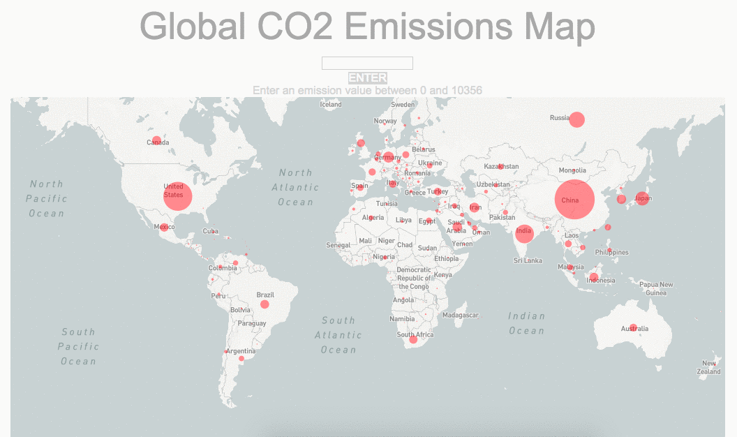
Dear Earth is a Geospatial Data Visualization project. It is a global map of nation level CO2 Emission and has an interactive input box that triggers smoke particles animation based on the users input on the country. The goal of this project is to raise awareness of the environmental problem humans are facing and visualize the different CO2 emission amount base on each country.
Link to running project on Github page
Process
When I first started learning Computation Media, if you trace back to my first blog post of the class, I wished that I could learn how to do data visualization using Javascript by the end of the semester. I am so glad that this already happened for my midterm. Also I realized how far I have been since 8 weeks ago. I used to do data viz with pure design tools. Now I see huge potentials in doing data viz using programing languages.
First I follow Dan Shiffman’s Coding Challenge video #57 and imported the world map from Mapbox to my canvas.

Then I start to see what data I can find for free. I found many interesting data and decided to use the yearly CO2 emissions data. It is a csv file.
Data source: https://data.worldbank.org/indicator/EN.ATM.CO2E.KT

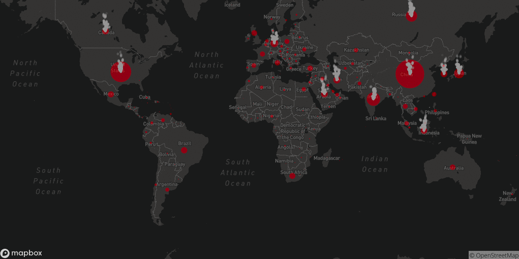
With this data sheet, I am able to draw rad circles based on the emission value of each nation and position it onto the nation’s latitude and longitude.

I soon realized that the emission value should be relative to the area of the circle but not the diameter. So I change the calculation and mapping so that the circles can more accurately represent the emission value.

Wouldn’t it be fun to animate the map? I used this smoke effect particles to mimic the CO2 emission.

I placed it to every circle on my map.
I tried different styles to get the most appropriate animation for the visualization.
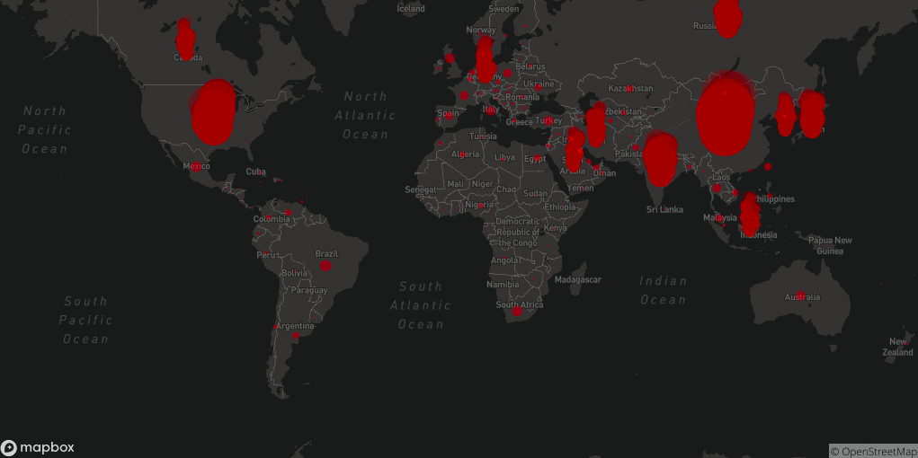
If the animation has a size relative to the emission value, it might block my original circles. (left GIF)
I change the settings so that it won’t block the circles containing the data and the nation’s name on the back. (center and right GIF)
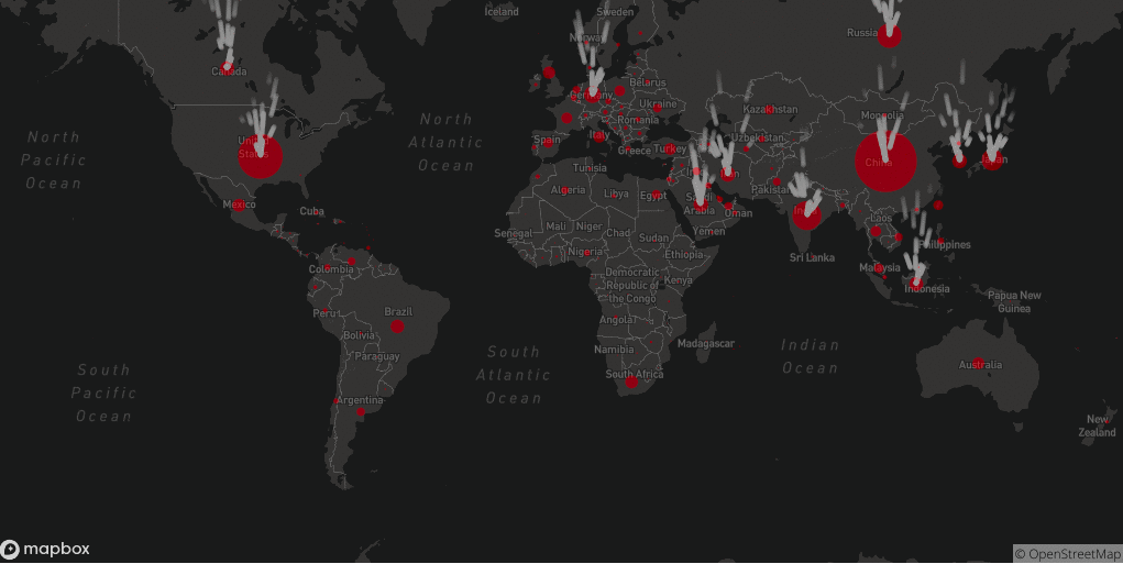

I also change the map style so that the smoke animation can be darker and look more like real smoke.
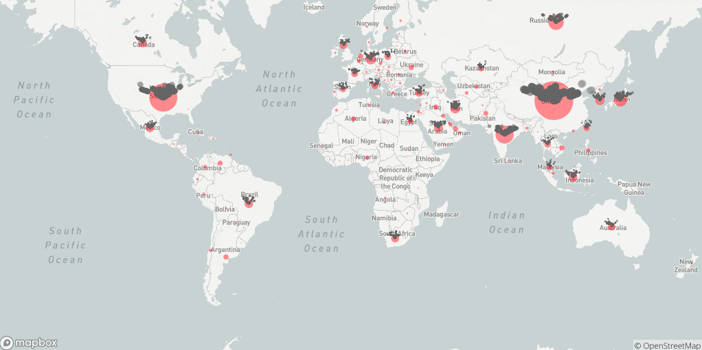
Some icing on the cake, I added HTML elements to make the map more interactive.
You can input an emission value and trigger the animation for all the nations that has an CO2 emission amount excess this value.
I spend many time figuring out the HTML and CSS elements because I am still not very familiar with them. Creating the input and button elements in HTML are very different from making them in P5. I am glad that I got the result I wanted and got to practice more coding languages that are not P5.
Link to full code on Github