


An Account Management System with user-centered design and effortless interaction flow for students and employees in NYU New York, Shanghai, and Abu Dhabi.
Final Design Demo
Overview
Start NYU is an identity management system for all students, faculties, and staffs in NYU New York City, Shanghai, and Abu Dhabi.
Goal
The UX goal of this project is to redesign the system NYU has been using for the past two decades and improve the usability of it with contemporary design solutions.
TEAM
UX Lead: Effy Fan
UX Research & UX Design : Effy Fan, Nicole Zhong, Mianying Chen
Design Process
Project Trajectory

01. Discover
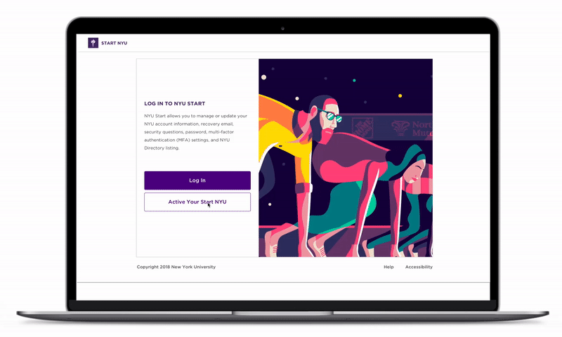
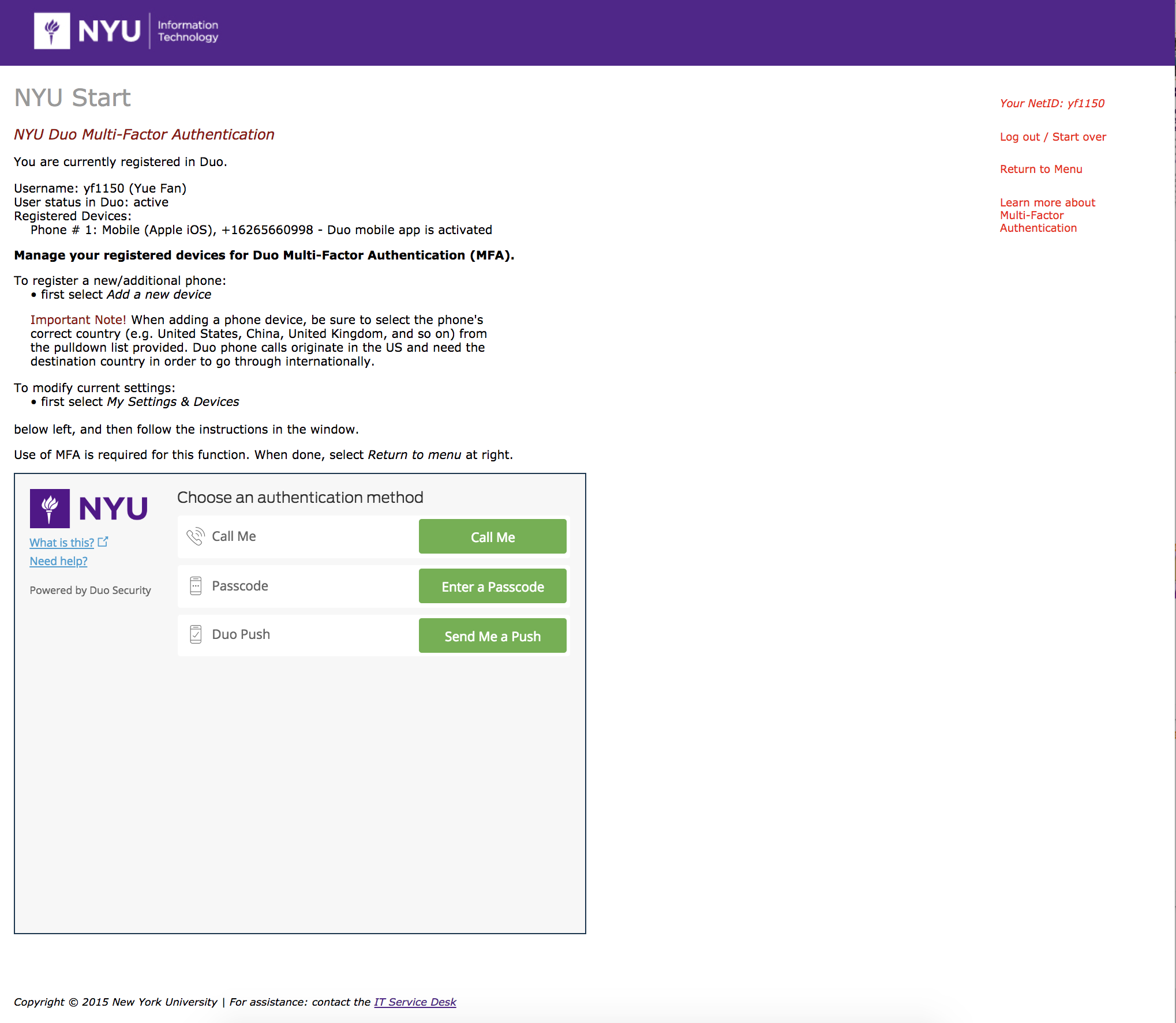
Current Start NYU Site


Heuristic Evaluation
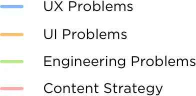
4 categories of Issues: UX, UI, Engineering Constrain, and Content Strategy
Primary Issues
UX - Confusing Information Architecture
The current user-flow for Start NYU is confusing because all the features are on the same level and there is no hierarchy.
UI - Design Lacking Visual Focus
Missed opportunity for NYU Branding since Start NYU is the first touch to technology service for all NYU members. There is no visual focus for the current website. The relationship between primary and secondary elements is not clear.
Engineering Constrain - Idle Time Cannot Change
The idle time for Start NYU is 5 mins, which is too short for some of the features. This time limit can not be extended or changed due to security concerns. We will have to design around this constrain.
Content Strategy - User Guide
The user guide of Start NYU is weak. Some contents and features on Start NYU are hard for users to understand from the description.
Secondary Issues


Usability Test and End User Interview


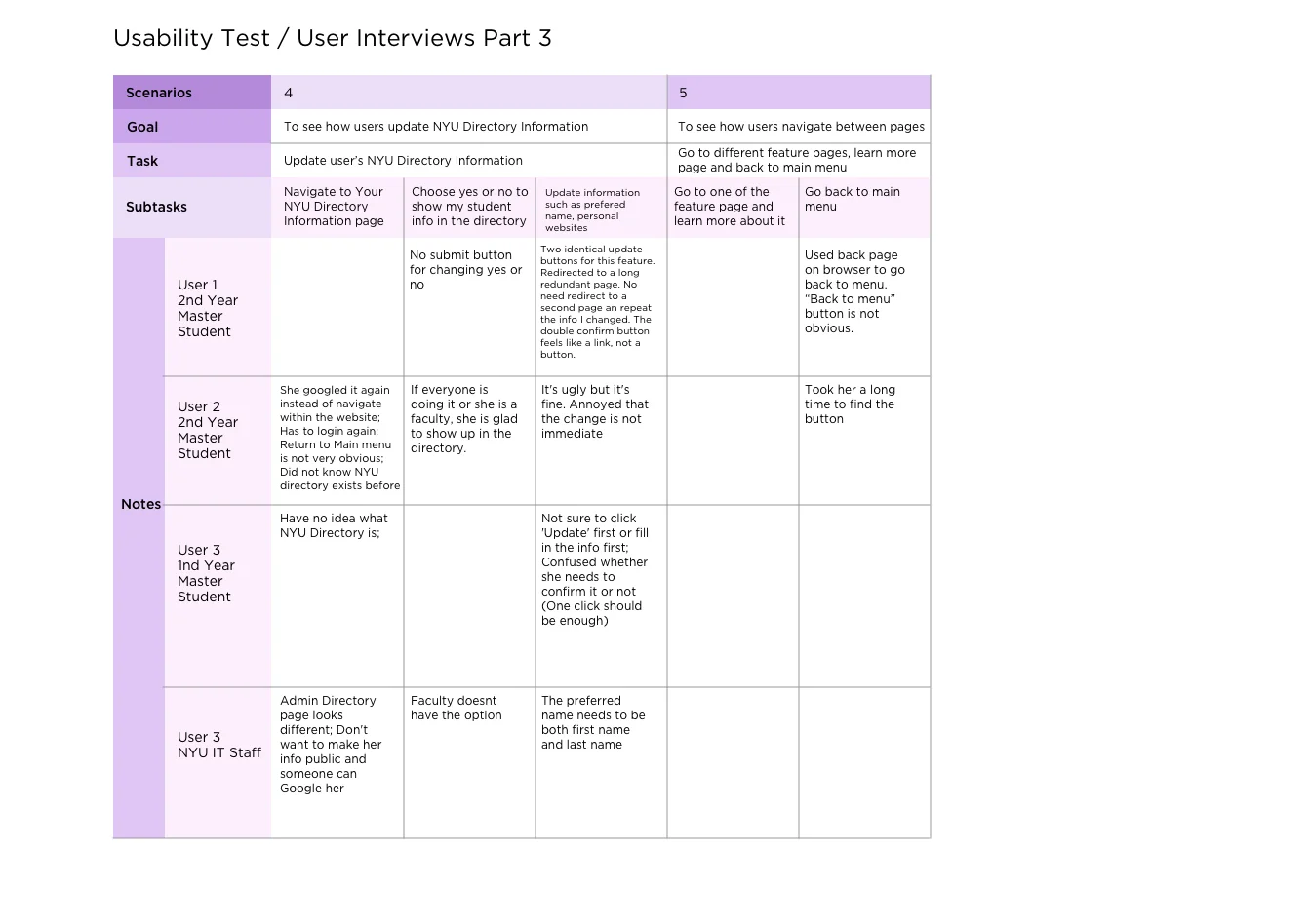
User Journey Maps
User 1: NYU 2nd Year Master Student
User 2: NYU 1st Year Master Student
User 3: NYU Freshmen
User 4: NYU IT Front Desk Admin


02. Define
Design Challenge Framing
We researched for cross-platform inspirations from existing account management systems such as Google, Adobe, Outlook, ID.me, Columbia Universit, etc. This helps us define appropriate solutions and features that can solve the pain points of the current Start NYU site.

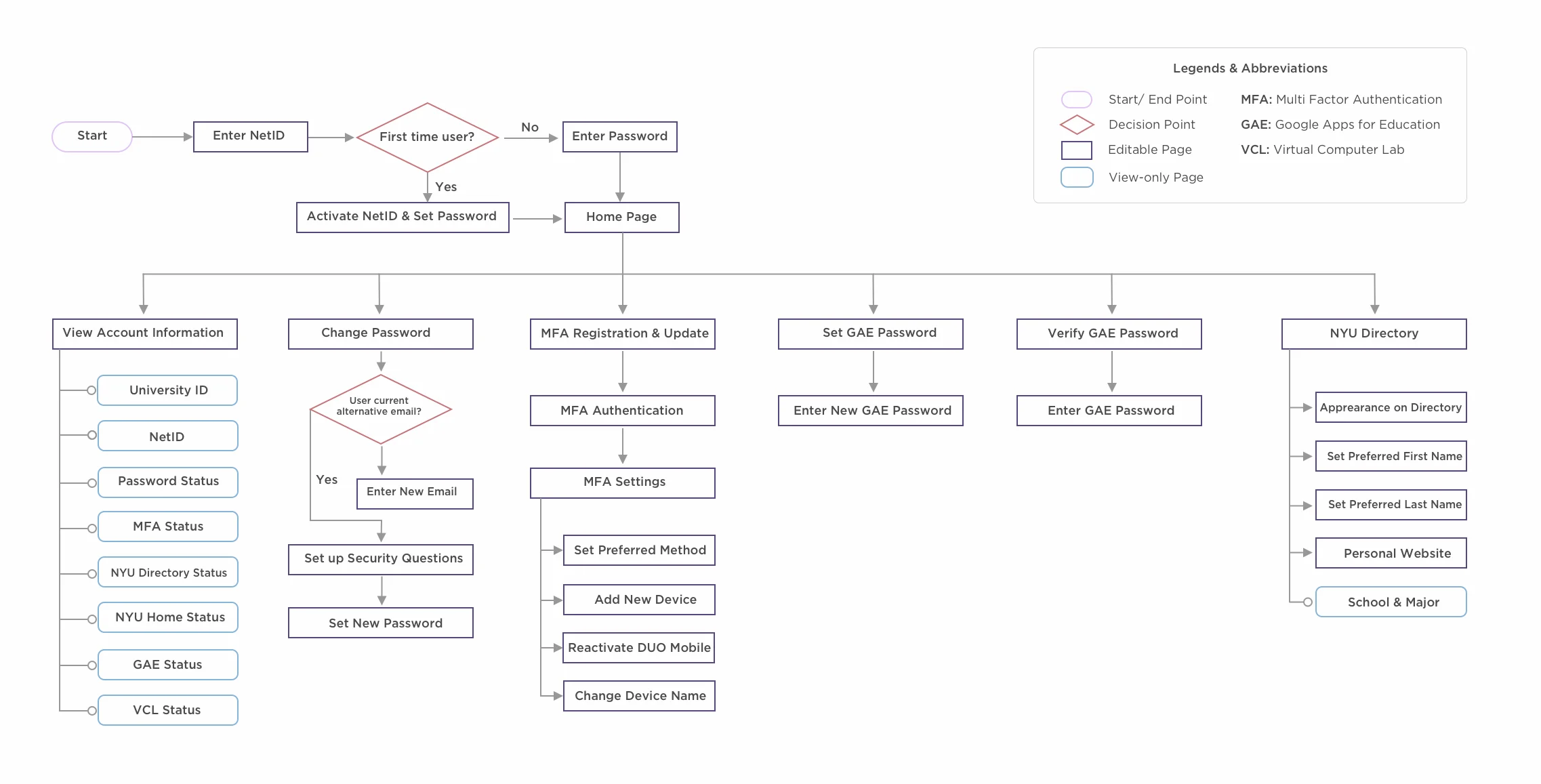
Information Architecture
Re-categorized the existing features and created a more intuitive architecture and flow.
03. Design
First Wireframes


User Testing
After designing the low fidelity wireframe, we conducted user testings with users of different age and role to see if we can better prioritized the problems and meets the users’ need.
NYU Information Technology Employer Age 40-50
NYU Graduate Student Age 23-30
NYU Undergraduate Student Age 20-22
Tisch School of the Arts Professor Age 55-65
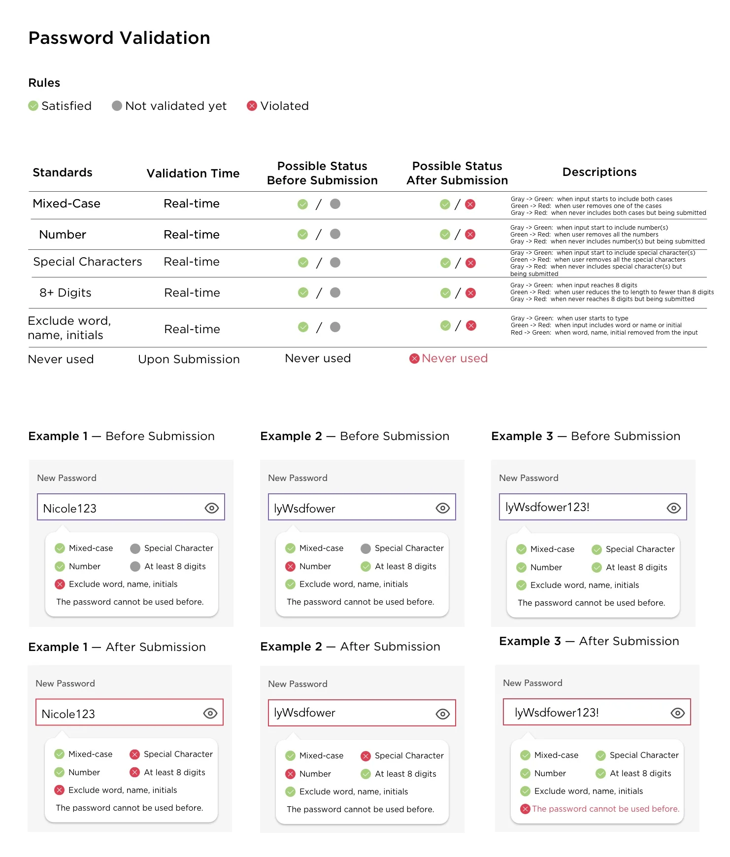
The most important thing we have to adjust after the user testing is the password validation hints. To help users easily set up a password that meets the NYU’s requirements, we used a color coded dynamic hint as users are setting up password. We did a second round of user testing and this method is proven to be very user friendly for all age groups.
04. Deliver
Final Design
Landing Page A/B Testing

3/5 Users under 30 years old prefer this design
1/5 User over 30 years old prefer this design

2/5 Users under 30 years old prefer this design.
4/5 User over 30 years old prefer this design


The final design is now handed to the engineer team for development. I am continuing to communicate with the engineers to best convey our design ideas.
Take Aways
I found the Start NYU project particularly challenging. Because Start NYU has a fixed structure for long history and a such wide range of users. We will have to deal with finding the balance between the more user-friendly design and the technique constrains.
Building a site that has to go through so many layers of stack-holders in NYU can also slow down the process tremendously. To overcome those challenges, we show the stack-holders our perspective of project trajectory with confidence, present our design solutions with visually appealing presentations, and reach out to different groups of end-users for user testing.
Thanks to Start NYU, I learned so much from the process of designing it. I realized that, great design should not only stand the test of time, but also keep up with the times. Looking back from two decades later, the new Start Page will keep evolving to meet the user’s need.