
CLIMOOD
UX/UI Design and Full-stack Development
Individual Work

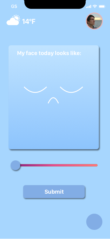
Climood is a mood tracker that compares your mood to the current weather. You can also view your mood history and see how the weather affects your mood over a long period of time.
GOALS
Have people evaluate their mood everyday.
Raise awareness about mental health.
Visualize the mental status of a group.
Help individuals or groups to better understand the mood trend over time.
POTENTIAL USERS
My prototype users: ITPers
Schools
Enterprises
Events
Tourists
etc…
PERSONA
I created personas for 4 people I care about. From a graphic designer’s perspective, the traditional persona format is not very visual friendly. It contains too many text and unrelated information. Instead, I created this more “poster-like” personas for each of my users.


USER FLOW CHART

UI DESIGN


PROTOTYPE INTERFACE DASHBOARD DESIGN
This is the prototype built with javascript and HTML. The back-end is also fully functional using MongoDB database and Digital Ocean server. I used this to do user testing.


Interface link: p5js.org/full/r1XaayCgG
Github link: https://github.com/effyfan/DWD/tree/master/final_CliMood
USER TESTING
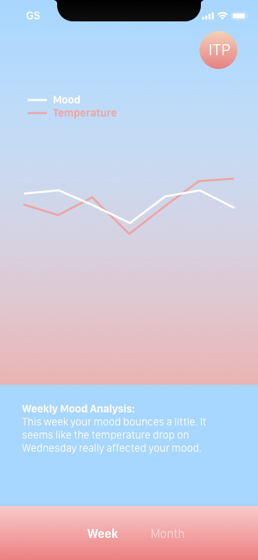
My intention is to install this interface in a public space for a certain group of people to input their mood. On December 7th, 2017, I put the interface up in front of the elevator where people enter and exit ITP and recorded how people interact with it. About 40 people participated in the user testing. I was able to discover not only the overall mood score of ITP students and faculties on that day, but also ways to improve my application. The average mood score was 6.4375 out of 10. The UI design needs to have easier accessibility and more responses based on the data collected should be added.
Here is the documentation video: